Federal agency data can support transformation and data-driven decision making, but it can prove challenging to present in a form that its users and stakeholders can understand.
Agencies recognize data as an important strategic asset, but endless rows of numbers on spreadsheets or static reports don’t allow for making important strategic or tactical decisions in the demanding and ever-changing environment of federal agency operations.
Data visualization provides the necessary refinement. By leveraging the power of data analytics to create real-time visualizations that align data insights with important agency mission and operational objectives, agency leaders can make more effective and timely decisions.
Making it make sense
Federal agencies face one of their biggest challenges when determining how to best access, store, govern and present the complex and voluminous data sets in their possession, which flow in every day. The World Economic Forum predicts that the amount of data generated daily will reach 463 exabytes by 2025. Today’s information users expect data to be clear and easy to interpret on multiple formats and devices. Data visualization allows organizations to provide information in a format that the data users will more likely find effective.
Effective data visualization takes many forms. At its simplest, it consists of graphics, such as bar charts, trend lines or pie charts. More creatively, data might be presented as an infographic generated using agency data, with predictive analytics, geospatial mapping and/or machine learning techniques to tell a story. Beyond presentation concerns, the volume of data often conceals undiscovered treasures.
Data visualization, when combined with strong data governance and data quality, offers a powerful tool for unearthing hidden links between data points. In many cases, it is like turning on the light in a dark room, illuminating previously unseen trends, patterns and connections.
Why Visualization?
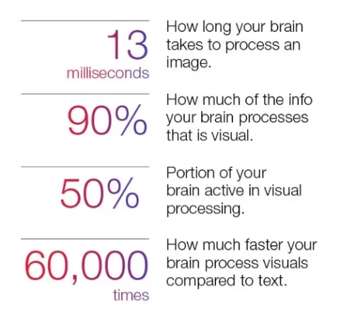
Visualizing data makes it much easier to comprehend, interpret and use. Why? Research points to how the human brain processes information:
Studies have shown that an infographic is 30 times more likely to be read than a full article. Readers share online presentations that feature data visualization more often than those without. Well-designed visuals also improve retention of data and encourage greater engagement with it.
The Harvard Business Review presented an interesting example. The managers of Boeing’s Osprey program were investigating the causes of inefficiencies in the military aircraft’s takeoffs and landings. The Osprey uses tiltrotors to take off and land vertically, like a helicopter. But each time the plane flies, its takeoffs and landings can generate a terabyte of data each, far too much for a team of engineers to interpret. Using data analytics to compare data and identify patterns, and then represent them in a visual format, turned the data into a useful asset.
Keeping control with governance
The collection, consumption, analysis and presentation of agency data needs a strong data governance model, not only to ensure access to the required data sources and analytical models, but also to promote vigilance in respecting ethical and legal boundaries. Additionally, a strong model includes techniques and criteria for selecting the right technology tools, as the already-crowded analytics technology market continues to navigate through an ongoing flow of new tools and solutions.
The Digital Accountability and Transparency Act (DATA Act) of 2014 establishes data standards, and the Office of Management and Budget and the Department of the Treasury have defined governance procedures for those standards. While the DATA Act does not provide all the elements of an effective data governance model, when combined with leading industry practices for data governance, agencies can use it to leverage their valuable data sets in an effective and responsible manner.
Federal agencies and other organizations rely on real-time analysis, with models produced as fast as the system ingests the data. You need to assess your needs before beginning a selection process, because not every solution out there will meet the requirements of a specific situation. Bear in mind also that technology doesn’t always integrate as seamlessly as vendors might suggest.
Choosing the right partner
The key to building your analytics solution? Have a partner focused on your business as achieving success is more than a technological exercise. Work with a partner who understands your business, process and mission to bring solutions that produce the right outcomes. The right partner will help create a tailored strategy and plan that provides a disciplined approach to ensure that your data visualization objectives are achieved.
CGI provides data visualization to large federal clients, creating business intelligence reports and visual presentations to enable agency leaders to make decisions quickly with accurate data.
Data analytics serves as a powerful tool, if agency leaders can easily understand the resulting information. Visualization, in many cases, provides the best way to make that happen.
Learn more about CGI Federal's Management Consulting services


