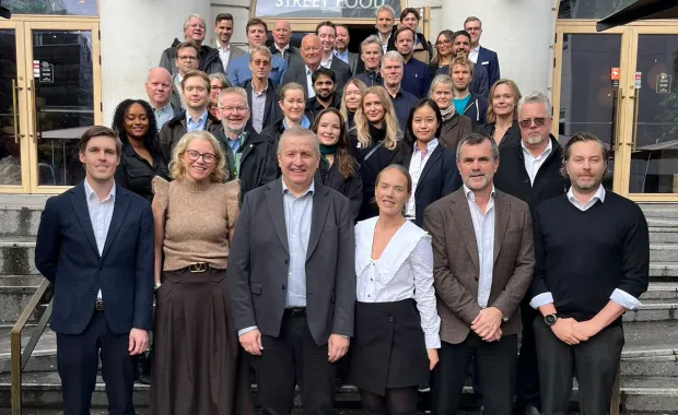
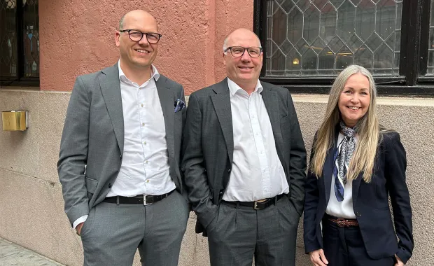
Nick Desbarats presenting

As an independent educator and consultant, Nick has taught data visualization and information dashboard design to thousands of professionals in over a dozen countries at organizations such as NASA, Bloomberg, The Central Bank of Tanzania, Visa, the Government of Canada, The United Nations, The University of Toronto, Marathon Oil, Shopify, and Teradata, among many others. Nick was the first and only educator to be authorized by Stephen Few to deliver his foundational data visualization and dashboard design workshops, which he taught from 2014 until launching his own workshops in 2019. Nick also frequently consults for large and mid-sized private, public and non-profit organizations, designing information dashboards for senior decision-makers and other roles.

For over 20 years, Nick has been designing information displays that enable senior decision-makers to make better, more data-driven decisions based on potentially large amounts of data, and to do so in less time and with less effort. He has extensive knowledge of data visualization, information dashboard design, business intelligence, data analysis, cognition and cognitive biases, perception, memory and learning, software design and development, and product management.  Nick's books Practical Charts and Practical Dashboards will be published in 2021.

May 2nd-5th, 13.30-17.00 (Central European Time)  – 4 days

CGI Academy is pleased to host a data visualization workshop by one of the world’s leading experts in the field. 

Nick Desbarats – Practical Charts

Course description

While there’s been a lot of talk in recent years about designing tables and graphs that “bring data to life”, “tell a story”, or “make data beautiful”, the unfortunate reality is that many charts that are created inside of organizations are ineffective. They don’t give readers the answers they need in order to do their jobs, fail to make key insights obvious, or are just plain confusing. A surprising number of charts fundamentally misrepresent the underlying data—even when the person who created it wasn’t trying to deceive anyone. Even major media outlets regularly publish charts that are confusing, ineffective, or misleading.

Developed by globally recognized data visualization expert and educator Nick Desbarats, the intensive Practical Charts course begins by equipping participants with practical knowledge of key best practices and common mistakes, and then builds on that knowledge to enable participants to create charts that are clear, compelling, and—most importantly—useful.

The course content is solidly grounded in data visualization and visual perception research, as well as Nick’s decades of real-world executive experience, however, the focus is on hands-on learning and practice so that participants return to their desks with the practical know-how to handle all of the data visualization challenges that they’re likely to encounter day-to-day.

 
Who should take this course?

Anyone who regularly creates tables and graphs as part of their work, including business and financial analysts, business intelligence and data analysts, policy analysts, executives, project managers, software developers, statisticians, data scientists, user experience designers, as well as human resource, marketing, sales, operations and finance professionals. Other professionals, such as researchers, journalists, health care professionals and educators will also benefit. Experienced data professionals will benefit from the workshop since having advanced data analysis expertise does not necessarily mean that one has mastered the skills necessary to communicate data effectively to others.

The course content is sector-agnostic, and participants come from a wide variety of public, private, and non-profit organizations. No prior technical or data visualization knowledge is required and no data visualization software is used during the course, however, participants should have at least some experience creating charts in a data visualization application such as Excel, Tableau, Qlik, JMP, etc.


When: May 2nd-5th, 13.30-17.00 (Central European Time) – 4 days
Discounted price: 7.300 NOK – until 31.03.2022
Ordinary price: 8.900 NOK

Read more about the workshop topics and register below!

Read more and register!

Practical Charts Workshop Topics
  • Nine data visualization myths

  • The six reasons why so many charts fail

  • Formatting charts

    • Color, legends, scales (five types), borders/axes/tick marks

  • The “big seven” chart types

    • Line charts, bar charts, pie charts, histograms, scatter plots, maps, tables

    • Important variants and alternatives of the big seven types (50+ chart types!) and when to use each

  • Making charts obvious

    • Making charts graphically obvious (i.e., obvious before the reader even starts reading titles or callouts) and minimizing cognitive effort

    • Accounting for different levels of audience graphicacy (ability to read graphs)

    • Effective chart titles, callouts, and annotations

  • Specific (but common) challenges and solutions

    • Visualizing outliers, visualizing seasonal data, special considerations for charts that will be generated automatically, etc.

  • What about…? (commonly asked-about topics)

    • Interactivity/filters, dual axis , combo charts, third (z) axis, VR/AR, AI, etc.

    • Chart types to avoid (radar graphs, funnel charts, etc.)

  • What now?

    • Recommended resources for further learning, selling audiences on simple, well-designed charts that make their lives easier, tips for spreading good practices in your organization, “open mic” (unanswered questions?)

  • Topics not covered

    • This is not a graphic design course and does not cover creating graphs that are artistic or eye-catching (but often less useful). The focus is on designing graphs and tables that are easy to read, unlikely to be misinterpreted, and —most importantly— useful.

    • This is not a software product training course. Participants should already have a basic working knowledge of at least one data visualization software product (Excel, Tableau, Qlik, JMP, etc.). All charts shown in the course can be created in any major, modern software product, and none require advanced software product knowledge.

    • This course does not teach participants how to create complex, esoteric chart types (node graphs, sunburst charts, etc.). Simple, familiar chart types are almost always the most effective choices for the day-to-day visualization needs of most organizations.

    • This course does not cover dashboard design or using data visualization for data analysis (only charts for communicating data to others are covered). For dashboard design training, see the course description for Practical Dashboards below.


May 9th-12th, 13.30-17.00 (Central European Time) – 4 days

CGI Academy is pleased to host a data visualization workshop by one of the world’s leading experts in the field.

Nick Desbarats – Practical Dashboards

Course description

Despite the fact that books and courses on information dashboard design have been available for years, many dashboards still fail to meet users' and organizations' expectations. Users have trouble finding answers to basic data-related questions and fail to notice urgent problems because they’re hidden behind clicks, hard to notice, or possibly not even on the dashboard. Because of these and other problems, many dashboards still end up under-used or even abandoned.

Based on Nick Desbarats’ experiences designing dashboards for over 50 large organizations and teaching dashboard design to thousands of professionals, the Practical Dashboards course uncovers the real reasons why so many dashboards fail to satisfy users and organizations; reasons that go far deeper than the visual design on which most dashboard books and courses focus. Workshop participants will learn a highly practical, actionable framework for creating a system of different types of dashboards that enable users to find answers to their data-related questions far more quickly and easily, including fundamental ones such as, “Is everything O.K. at the moment?”, often for the first time.

Who should take this course

The Practical Dashboards course provides specific strategies, frameworks and best practices for those who are directly responsible for designing or developing information dashboards for employees, partners, stakeholders, and/or customers of their organization. Participants typically include business intelligence professionals, data analysts, reporting managers, software developers, user interface designers, and similar roles. The strategies and frameworks in the course are sector-agnostic and are applicable to organizations in the finance, manufacturing, technology, health care, banking, insurance, government, military, non-profit, education, and most other sectors. Senior managers and other decision-makers who consume dashboards will also find the course to be of value since it enables them to ask for dashboard designs that help them to be more effective at their jobs. The course does not assume any specific prior technical knowledge.


When: May 9th-12th, 13.30-17.00 (Central European Time) – 4 days
Discounted price: 7.300 NOK – until 31.03.2022
Ordinary price: 8.900 NOK

Read more about the workshop topics and register below!

Read more and register!

Practical Dashboards Workshop Topics
  • Major topics Untangling the word “dashboard”

    • The eight fundamentally different types of information displays that are, unfortunately, all called “dashboards”
    • The two high-level categories in which the eight types of “dashboards” fall:
      • “Live Data” Dashboards that are based on data that’s refreshed regularly (hourly, monthly, etc.), and that enable an organization’s employees, partners, customers, or other stakeholders to interact with the organization’s data (e.g., operations dashboard, CFO dashboard, project dashboard, etc.)
      • “Static Data” Dashboards that are based on a static snapshot of data that may never be updated, and that are typically used for persuading or educating a target audience.
    • Note that only “Live Data” Dashboards are discussed in detail in the course.
  • “Live Data” Dashboards
    • Visual design best practices (color, layout, fonts, etc.)
    • The three major categories of “Live Data” Dashboards: Status Dashboards, Performance Dashboards, and Canned Analysis Dashboards
    • Status Dashboards for providing an overview of current conditions and spotting metrics that require attention (three types):
      • Entity Dashboards about a single type of entity (e.g., dashboard of employees, dashboard of transactions, dashboard of projects, etc.)
      • Area Dashboards about an area of the organization (e.g., finance dashboard, EMEA dashboard, call center dashboard, etc.)
      • Role Dashboards that contain all of the information that a given role needs to do their job (e.g., CEO dashboard, account representative dashboard, etc.)
      • Panels that should be added to Status Dashboards to maximize usefulness and user satisfaction:
        • Buried Problem Panels that surface problematic metrics that would otherwise be hidden behind drill-downs, filters, tabs, etc.
        • Entity List Panels that enable users to see and act on filtered lists of employees, transactions, etc.
        • Entity Detail Panels that show detailed information about a single employee, transaction, etc.
        • Description Panels that enable users to refer to static, background information about metrics without cluttering dashboards with static, non-updating information
      • How to automatically detect and flag metrics that require attention on dashboards:
        • Why conventional methods for flagging metrics that require attention (% change vs. previous period, % deviation from target, etc.) don’t work
        • The “Four-Threshold Method” for reliably flagging metrics that genuinely require attention
        • The “Metric Evaluation Pipeline”, a series of logical and statistical tests for automatically detecting metrics that require attention for a variety of reasons so that they can be visually flagged on dashboards
      • Performance Dashboards for assessing how well the organization is achieving its high-level strategic goals and identifying ways in which the organization can improve performance in the future
      • Canned Analysis Dashboards that automate potentially complex analyses behind a simple user interface that can be used by non-analysts
    • “Static Data” Dashboards (not discussed in depth in this course)
      • Persuasion Dashboards for persuading an audience to adopt a particular point of view, take a particular action, etc.
      • Explanation Dashboards for educating an audience about a concept, process, situation, etc.
      • Engagement Dashboards for drawing as much attention as possible to a topic
    • Implementation and maintenance guidance, wrap up.
  • Topics NOT covered
    • How to use specific software products (Tableau, Power BI, Qlik, etc.). The frameworks and best practices that are recommended in Practical Dashboards can be implemented using most major commercial dashboard development products.
    • How to create visually impressive dashboards, i.e., infographics. Only “Live Data” Dashboards are discussed in detail, and these are recommended to have a plain, minimalist visual design. “Static Data” Dashboards, which can have visually impressive designs, aren’t discussed in detail.
    • Performance measurement and improvement best practices (organizational and personal goal setting, strategic planning, KPI selection, etc.), though books on these topics are recommended in the course.

The Zoom online training platform will be used for this workshop. Some organizations disallow or block certain online training platforms, so we ask that you confirm that you can use Zoom before registering. You can try joining a Zoom test session here: https://zoom.us/test


Need assistance?

Please e-mail peter.stromberg@cgi.com for group orders or for personal assistance.

For English speaking participants, please register by e-mailing peter.stromberg@cgi.com and provide your contact and invoice information.